Objective
The goal was to develop a bold, recognizable identity for NextGen Heavy Haulers, a company specializing in heavy hauling and transportation. The logo needed to communicate strength, precision, and reliability while remaining simple enough to work across trucks, social media, apparel, and other brand applications.
Concept
The initial concept focused on creating a symbol that could represent the heavy-haul industry without relying on a truck illustration. The final mark combines the shape and strength of a bull with the recognizable form of a semi-truck, creating a symbol that feels powerful, rugged, and industrial. The bull represents strength and determination, while the truck connects directly to the company’s heavy-haul work. Strong geometric forms and symmetry help keep the logo modern, bold, and easily recognizable.

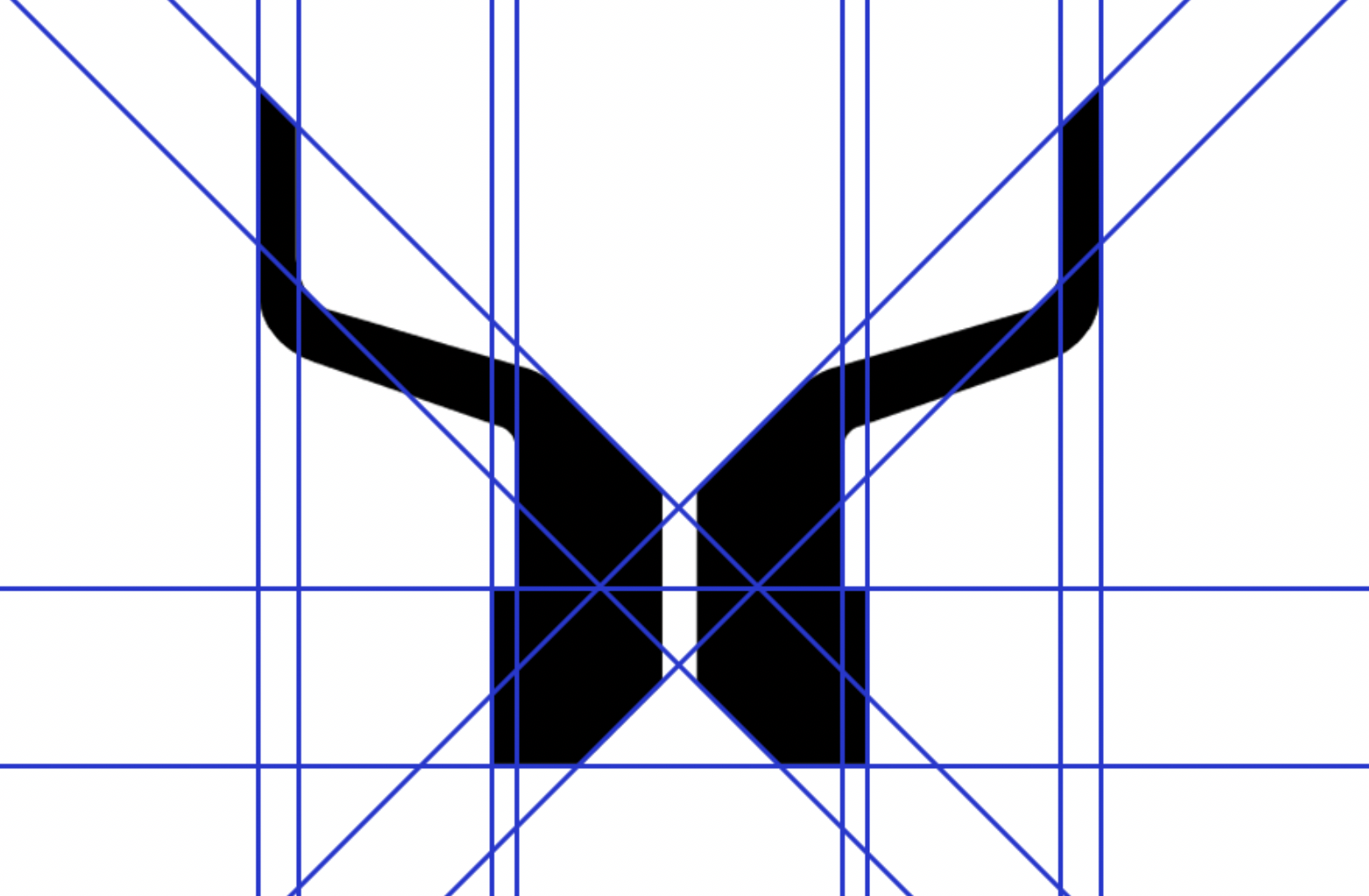
Grid System
A structured grid was used to establish relationships between each element of the design. Consistent spacing, alignment, and proportions helped create a visual system that could be repeated across different compositions.
Final Design
The final design combines a bull and semi-truck into one logo. The bull represents strength and power, while the truck connects it to the heavy-haul industry. The simple bold design makes the logo easy to recognize and use on trucks, clothing, and other branding.

Color