Objective
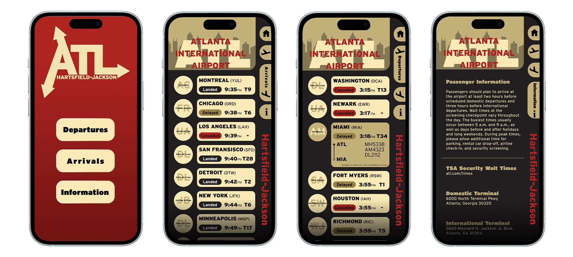
Design a mobile flight information interface that delivers clear, real-time updates for arrivals and departures. It aims to establish a clean, scalable layout that maintains readability and usability across different screen sizes and typographic hierarchies.
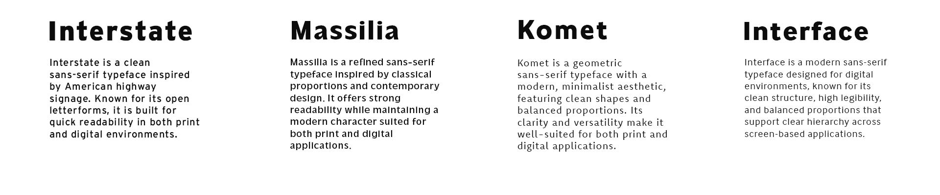
Typeface Studies
Interface Studies
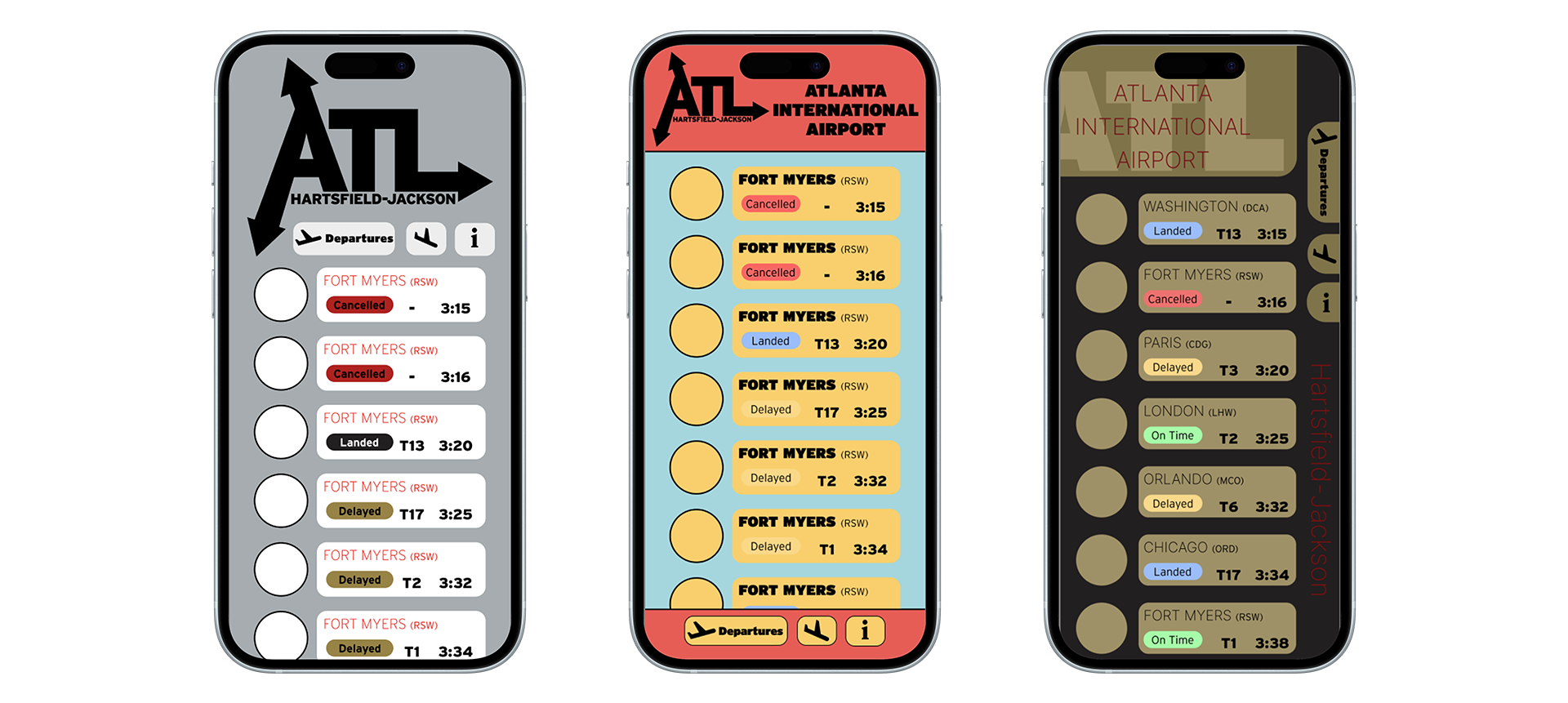
Different layout and navigation options were explored to understand how typography and spatial structure interact within the app’s interface, helping refine clarity, hierarchy, and overall user flow.
Color Studies
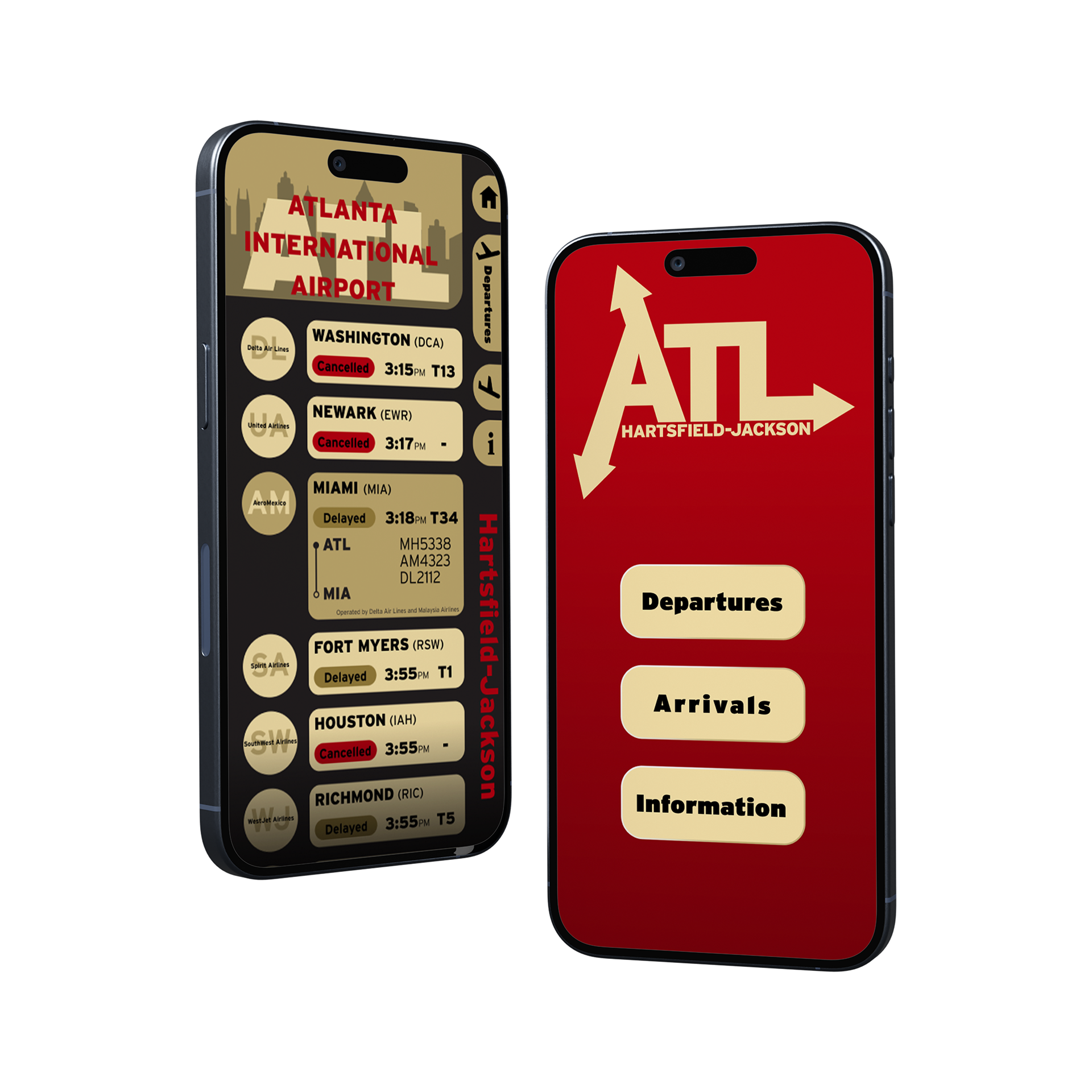
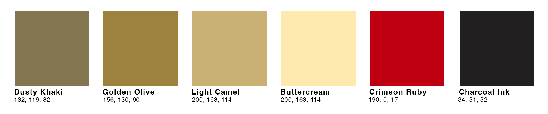
The interface uses Dusty Khaki, Golden Olive, Light Camel, Buttercream, Crimson Ruby, and Charcoal Ink as its core colors, inspired as a subtle derivative of Atlanta United FC’s identity to connect the design to the city. The palette balances warmth and contrast while keeping a clear visual structure for flight information. Crimson Ruby is used to indicate cancelled flights, Golden Olive signals delays, and the remaining tones support hierarchy, readability, and background structure across the interface.
Final Design
The final design combines typography, color, and navigation into a unified system that feels cohesive and easy to follow. Every element works together to create a clear visual hierarchy, allowing users to move through flight information quickly without confusion.